Context

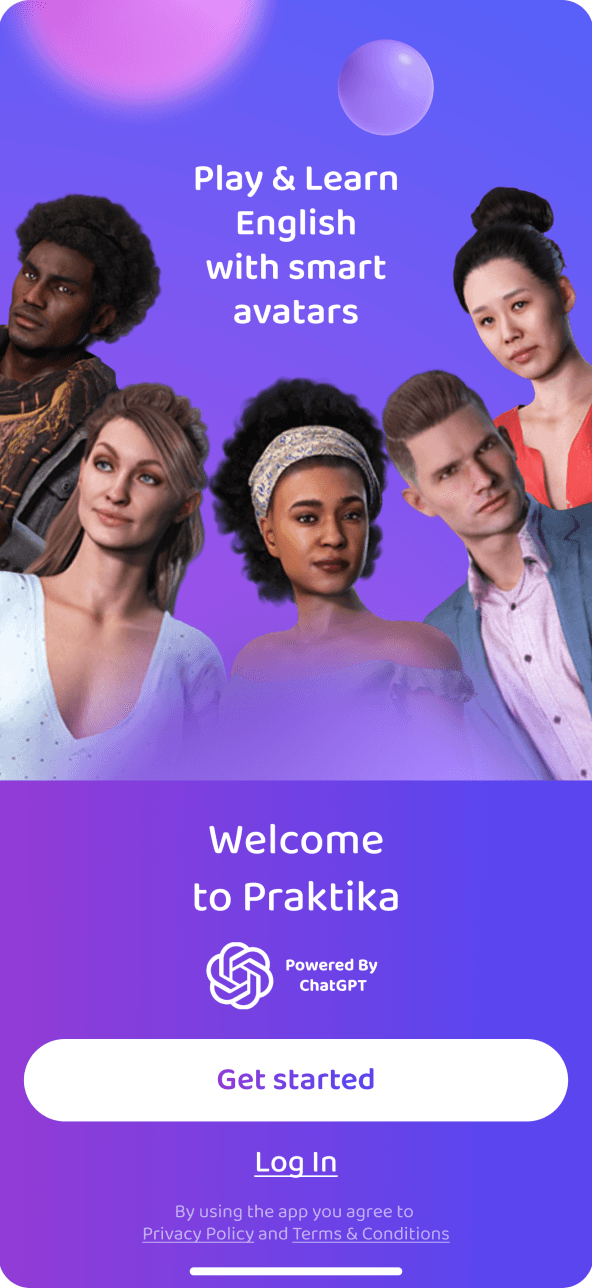
Onboarding is the longest and most involved journey in the product. It leads to the first trial lesson—the moment when users experience its value. Some people were leaving before they got there,
making onboarding a critical journey to rethink.

The product hypothesis

We believed a longer onboarding could still convert well if people understood why each step mattered and felt themselves moving toward a result. The goal was not simply to cut steps, but to turn a questionnaire into an experience with purpose.

Insights

Our analysis showed that people will complete a longer journey
when it feels like a conversation rather than a form. Personalization only becomes valuable when they can see the impact of their choices before onboarding is over.

The original flow

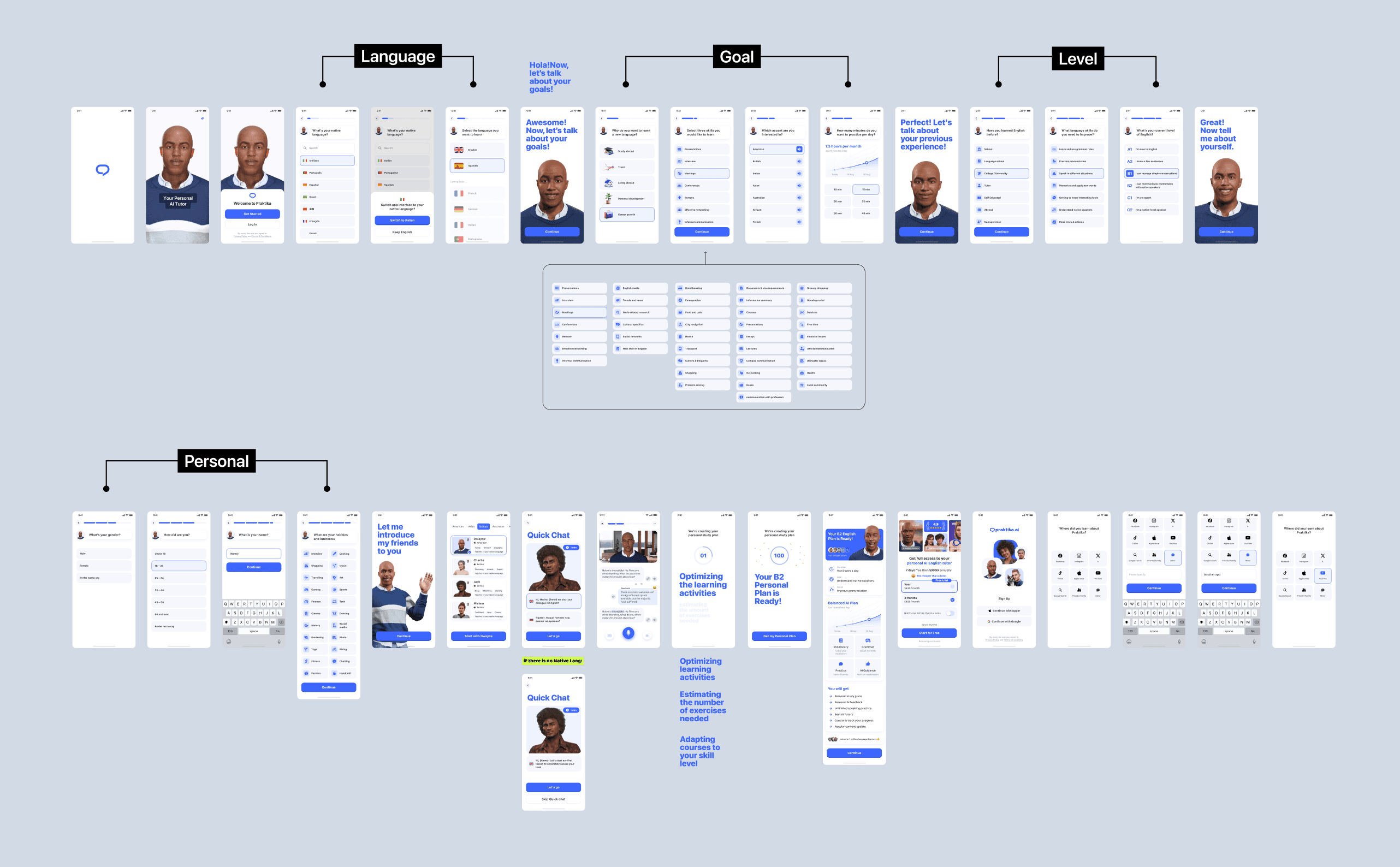
The original onboarding collected everything needed to personalize the experience. But without a clear rhythm
or meaningful signposts, some users left before the first trial lesson—the point where the product's value becomes real.

Principles and solutions

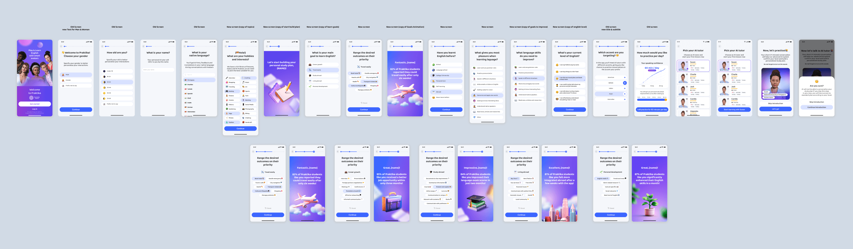
We reshaped onboarding as a conversation led by the product's main character. The character guides users and sets the tone, while transitions between sections make the journey feel less like
filling out a form.

The trial lesson remained the key activation moment. We removed premium restrictions there so users could experience the subscription's value before deciding.
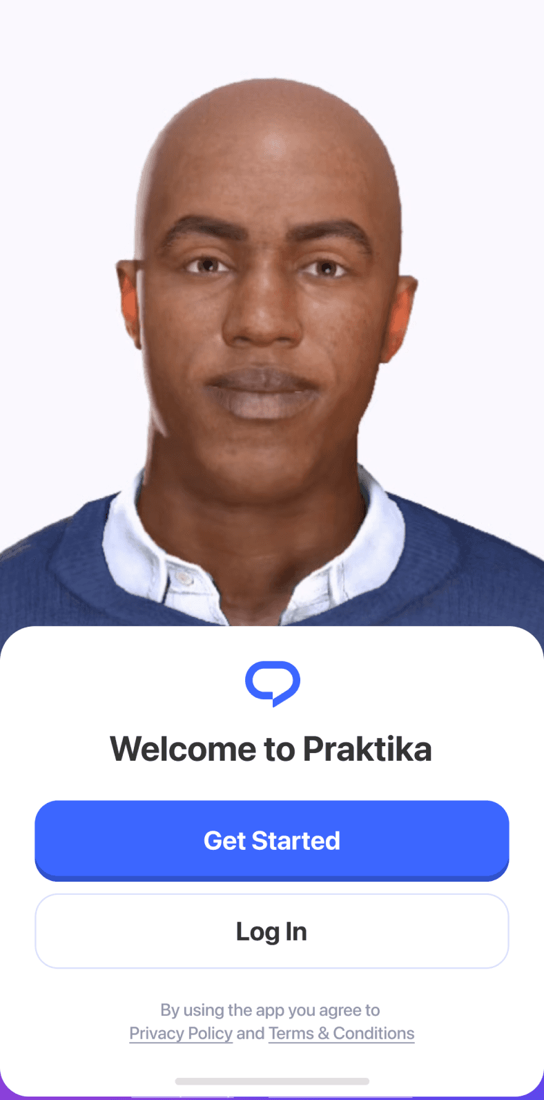
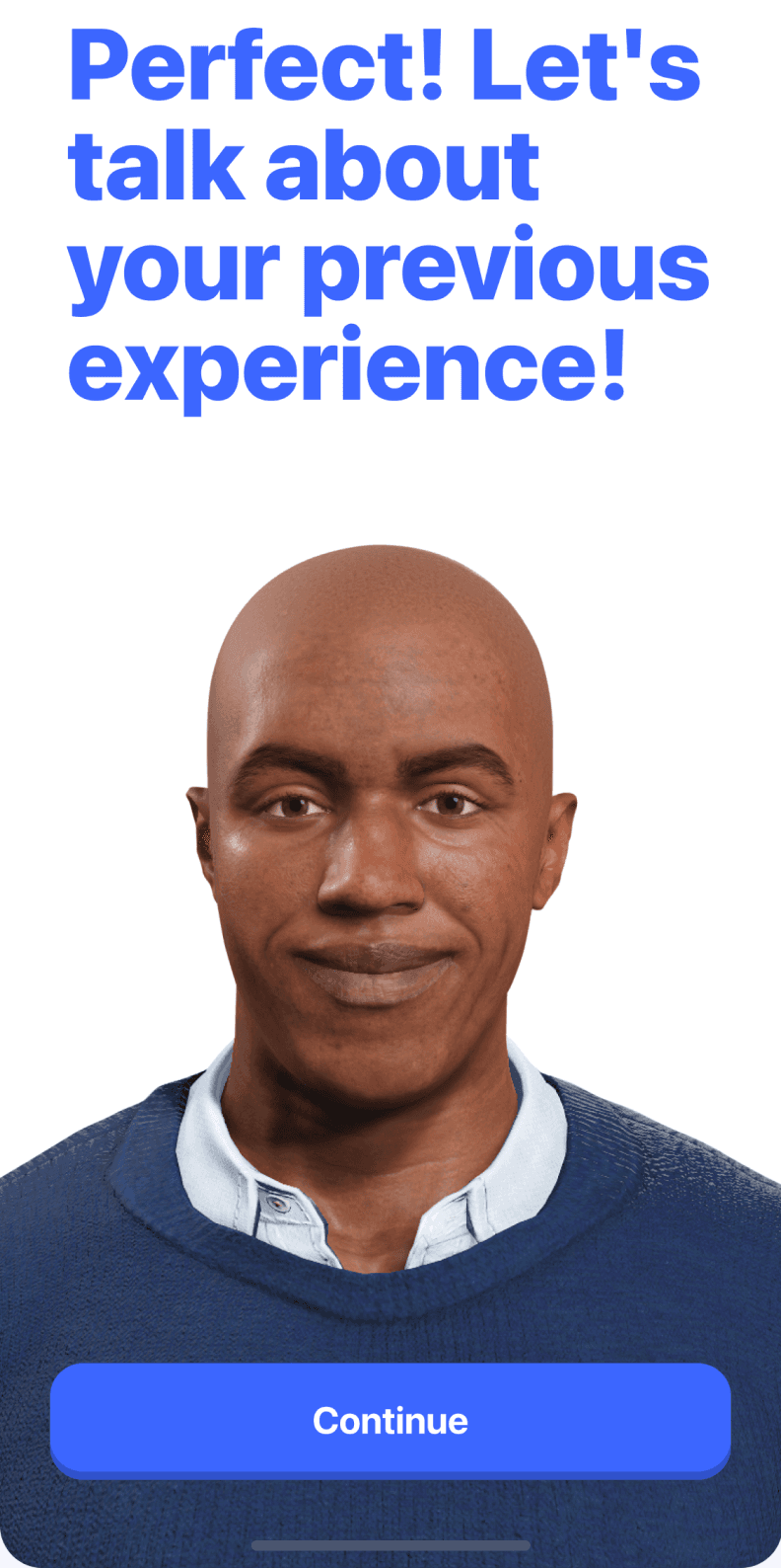
An introductory video with the main character now sets the tone and makes the experience feel conversational from the start.

Early in the flow, users can choose their native language and switch the interface. This lowers the barrier for people who are not yet comfortable with English
and makes onboarding accessible
from the very first screen.

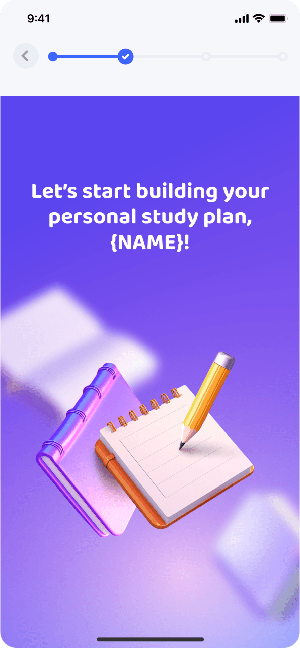
Transition screens give the journey rhythm and prepare users for what comes next.

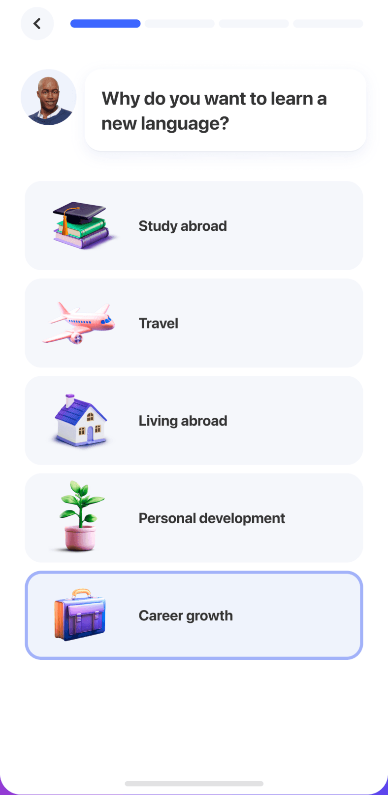
We made goal selection clearer by replacing emoji
with illustrations and icons.

We simplified the screen visually so attention moves away from charts
and forecasts and toward the real decision: how much time
the user wants to practice each day.

Tutor selection: we added an accent filter.

Before the first lesson, we removed visual noise to make starting feel less intimidating.

The first lesson, Quick Chat, is now available
in the user's native language.

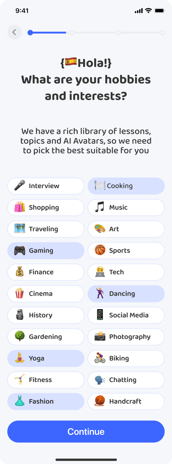
We redesigned the interests screen, replacing emoji with icons and removing unnecessary copy.
The result is less visual clutter and a long list that is easier to scan.

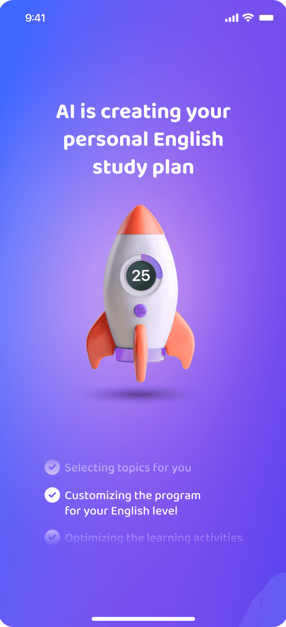
After the first lesson, we redesigned the wait screen for the personalized plan. Instead of showing an abstract animation, it explains each step of what happens to the user's information, making the wait feel more transparent.

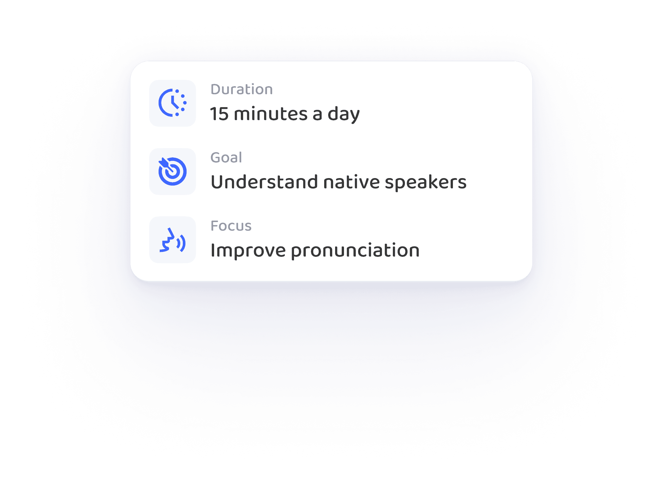
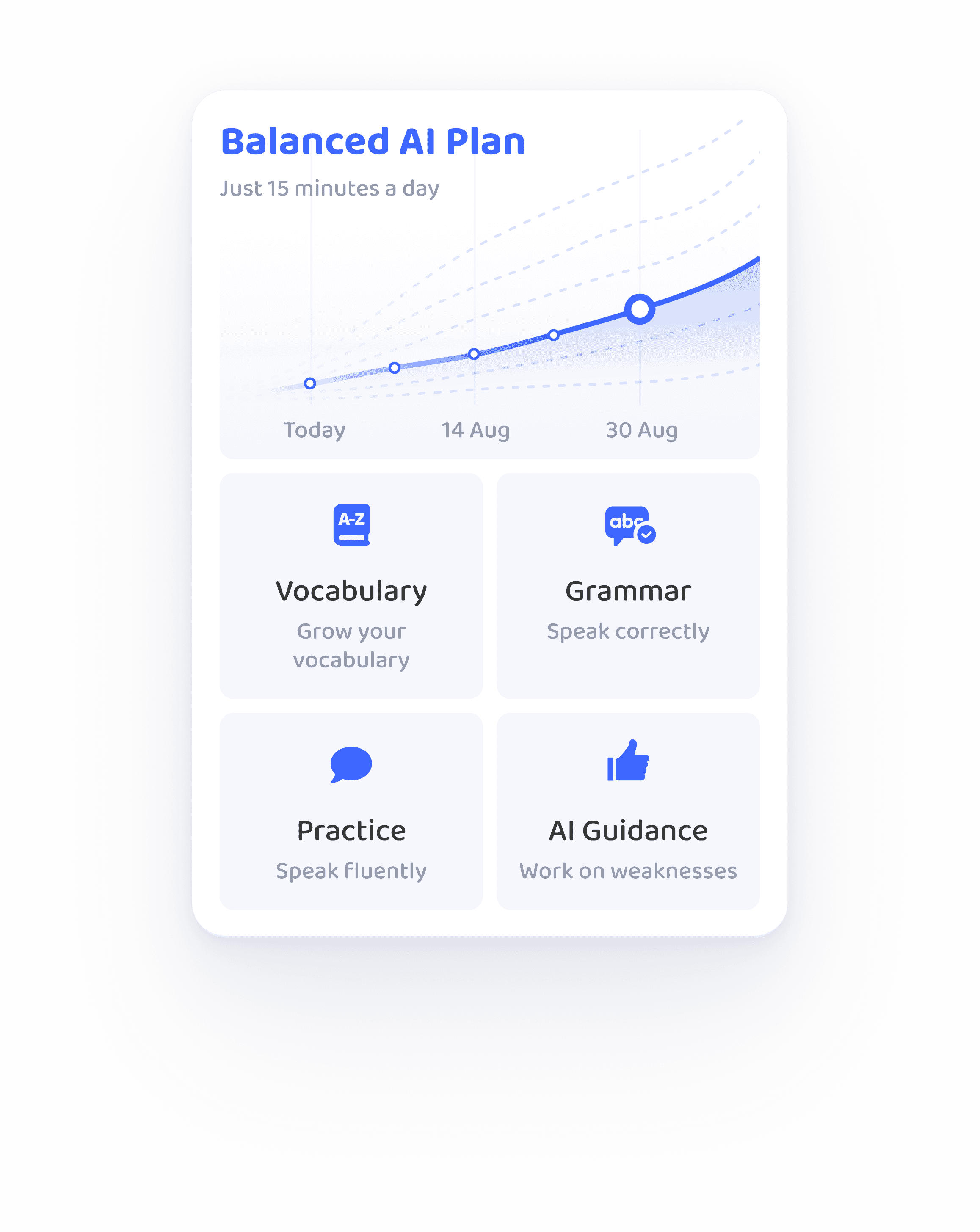
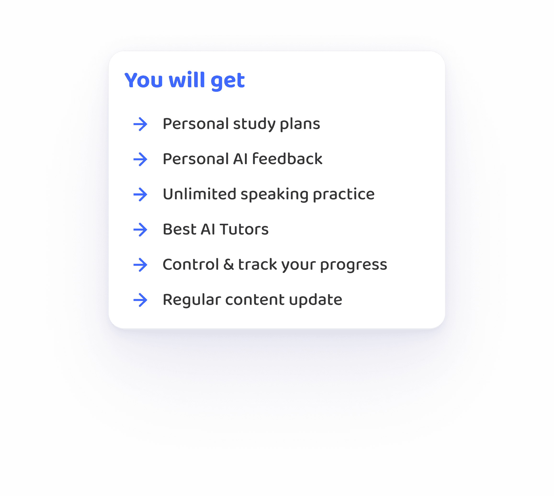
The journey now ends with a summary of the learner's personal plan. It brings their answers together into a tangible result and reinforces the value of the process before the next step.

+24 unique tutors

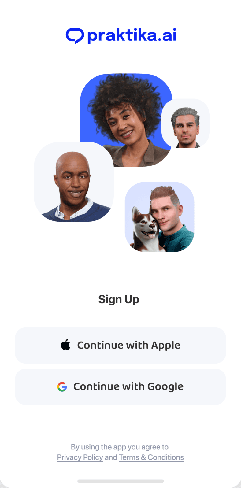
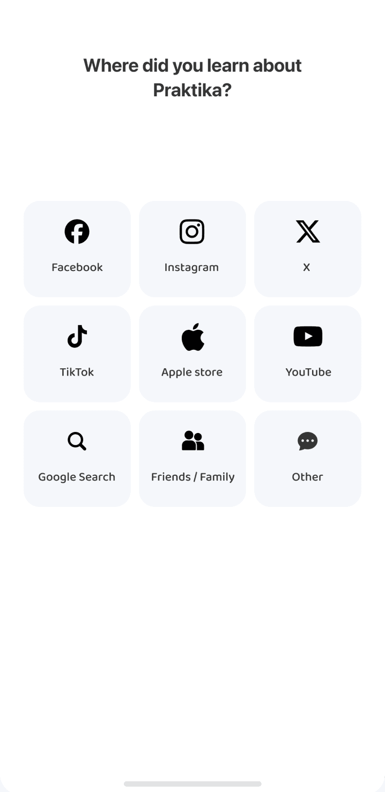
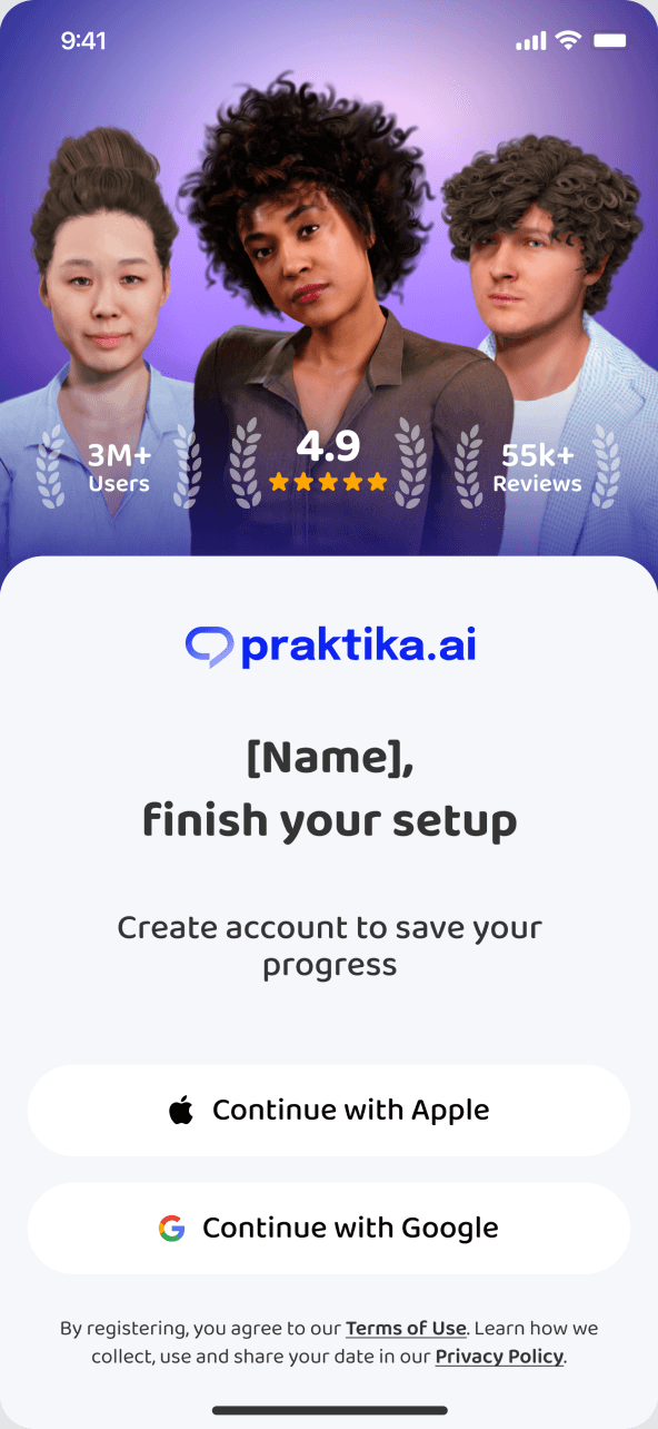
We refreshed registration and added a step to learn where new users found us.

Success metrics

• Activation Rate — more users
starting their first trial lesson after onboarding.

• Trial-to-Paid Conversion Rate — more learners converting
from a trial lesson to a subscription.

• Drop-off Rate — fewer users
leaving onboarding before their first lesson.

© 2025

Vladislava Burtseva — product designer

Create a free website with Framer, the website builder loved by startups, designers and agencies.

Product designer

Praktika Features

Onboarding

Context

Onboarding is the longest and most involved journey in the product. It leads to the first trial lesson—the moment when users experience its value. Some people were leaving before they got there, making onboarding a critical journey to rethink.

The product hypothesis

We believed a longer onboarding could still convert well if people understood why each step mattered and felt themselves moving toward a result. The goal was not simply to cut steps, but to turn a questionnaire into an experience with purpose.

Insights

Our analysis showed that people will complete a longer journey when it feels like a conversation rather than a form. Personalization only becomes valuable when they can see the impact of their choices before onboarding is over.

The original flow

The original onboarding collected everything needed to personalize the experience. But without a clear rhythm or meaningful signposts, some users left before the first trial lesson—the point where the product's value becomes real.

Principles and solutions

We reshaped onboarding as a conversation led by the product's main character. The character guides users and sets the tone, while transitions between sections make the journey feel less like filling out a form.

The trial lesson remained the key activation moment. We removed premium restrictions there so users could experience the subscription's value before deciding.

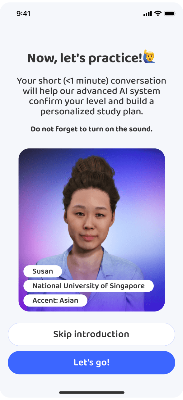
An introductory video with the main character now sets the tone and makes the experience feel conversational from the start.
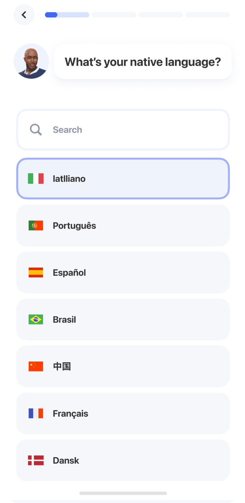
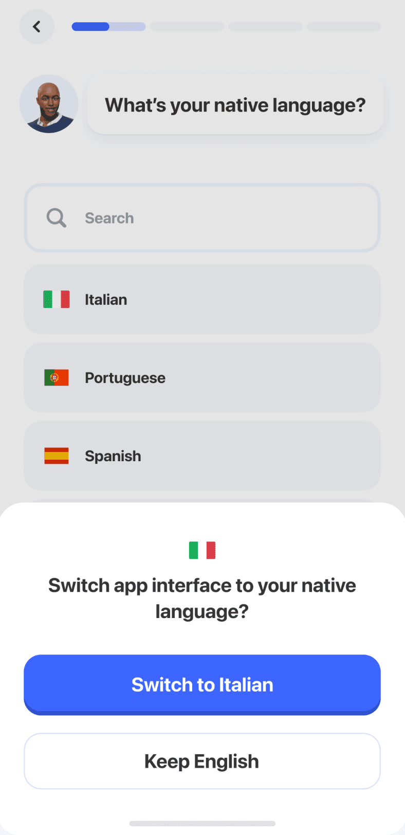
Early in the flow, users can choose their native language and switch the interface. This lowers the barrier for people who are not yet comfortable with English and makes onboarding accessible from the very first screen.
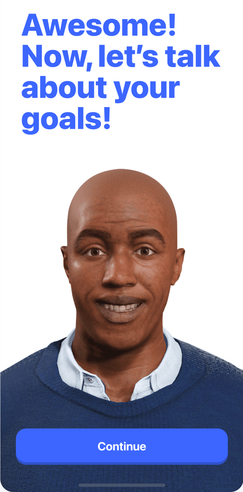
Transition screens give the journey rhythm and prepare users for what comes next.
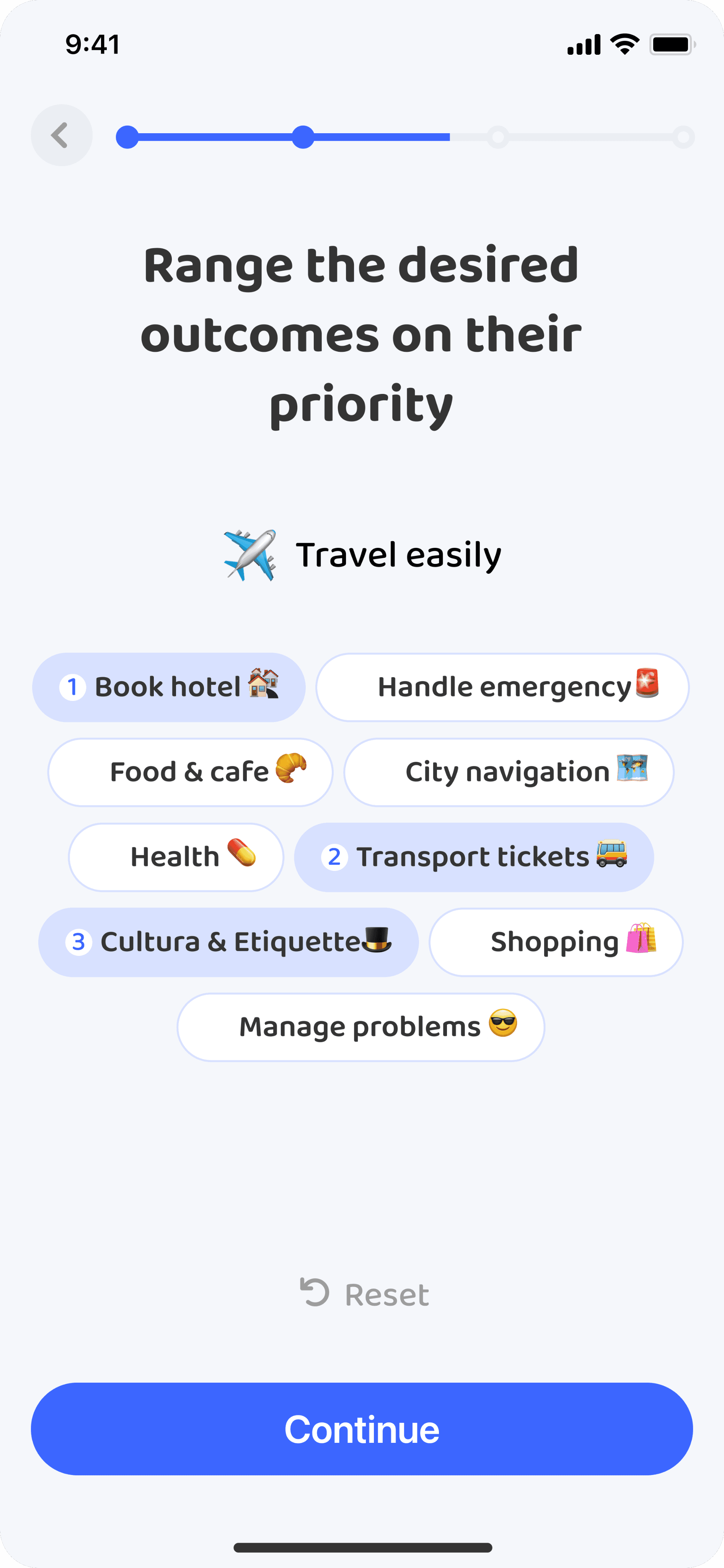
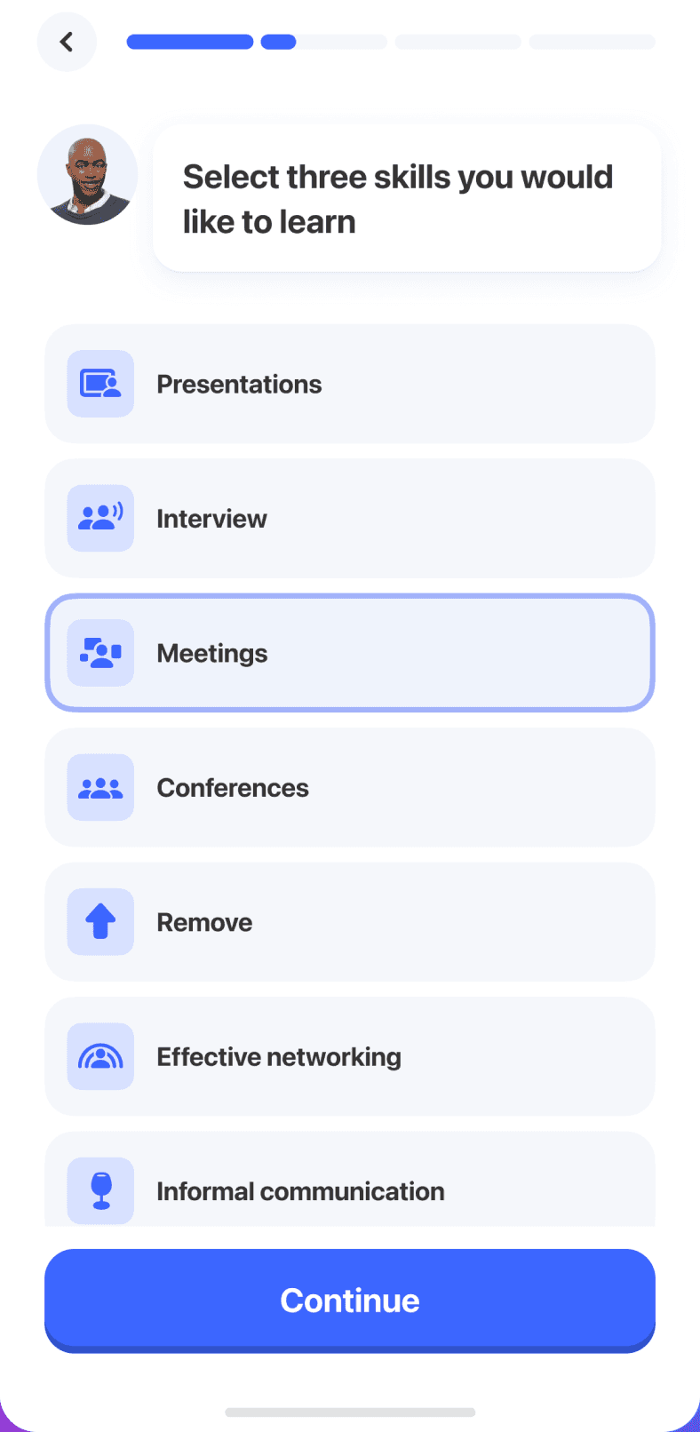
We made goal selection clearer by replacing emoji with illustrations and icons.
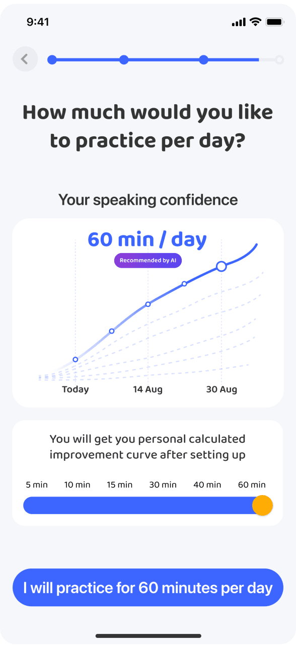
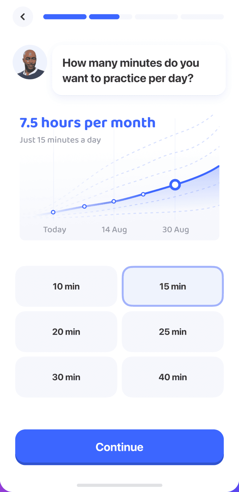
We simplified the screen visually so attention moves away from charts and forecasts and toward the real decision: how much time the user wants to practice each day.
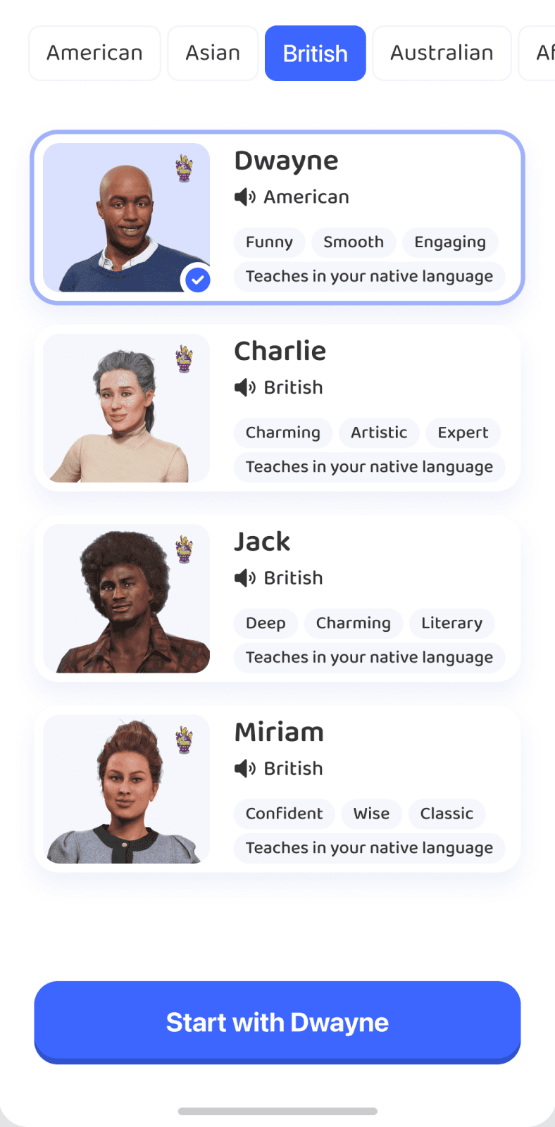
Tutor selection: we added an accent filter. Before the first lesson, we removed visual noise to make starting feel less intimidating.

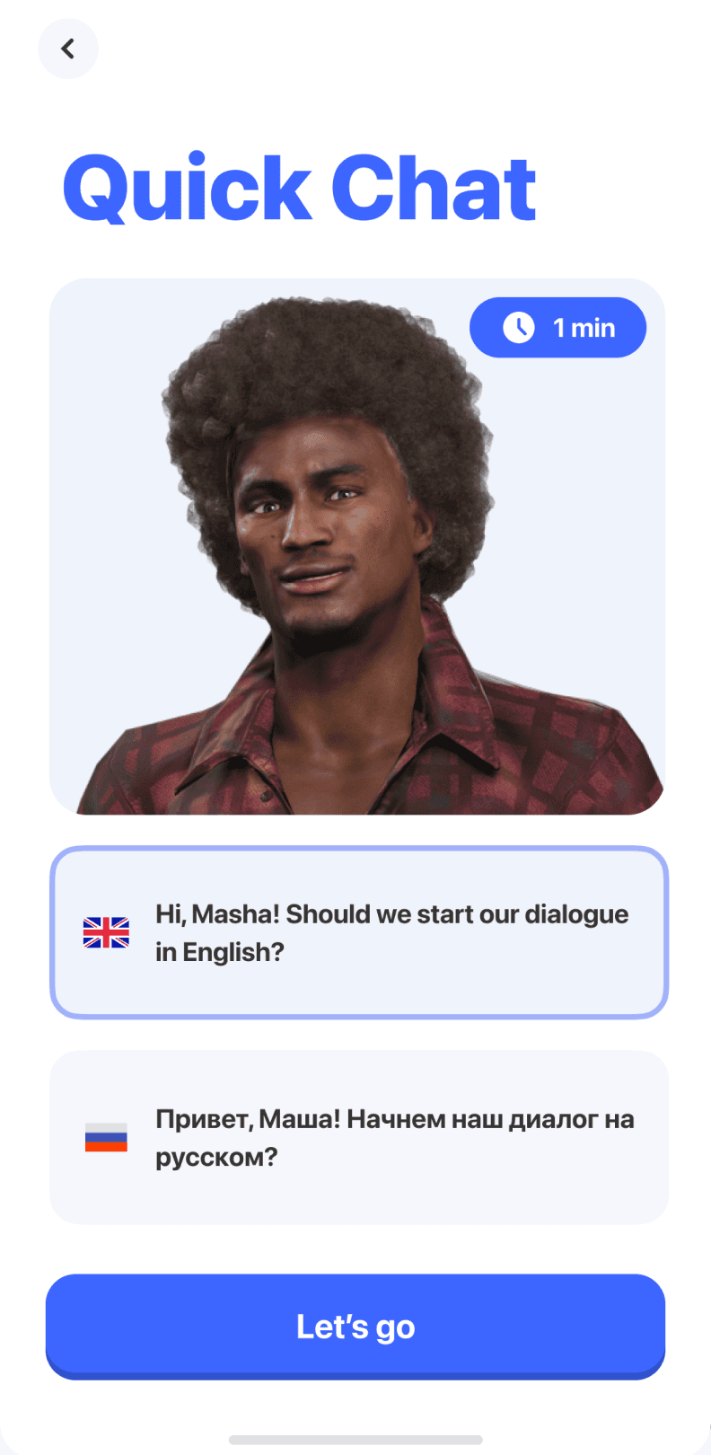
The first lesson, Quick Chat, is now available in the user's native language.
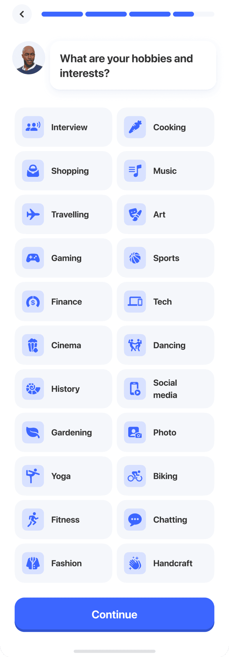
We redesigned the interests screen, replacing emoji with icons and removing unnecessary copy. The result is less visual clutter and a long list that is easier to scan.
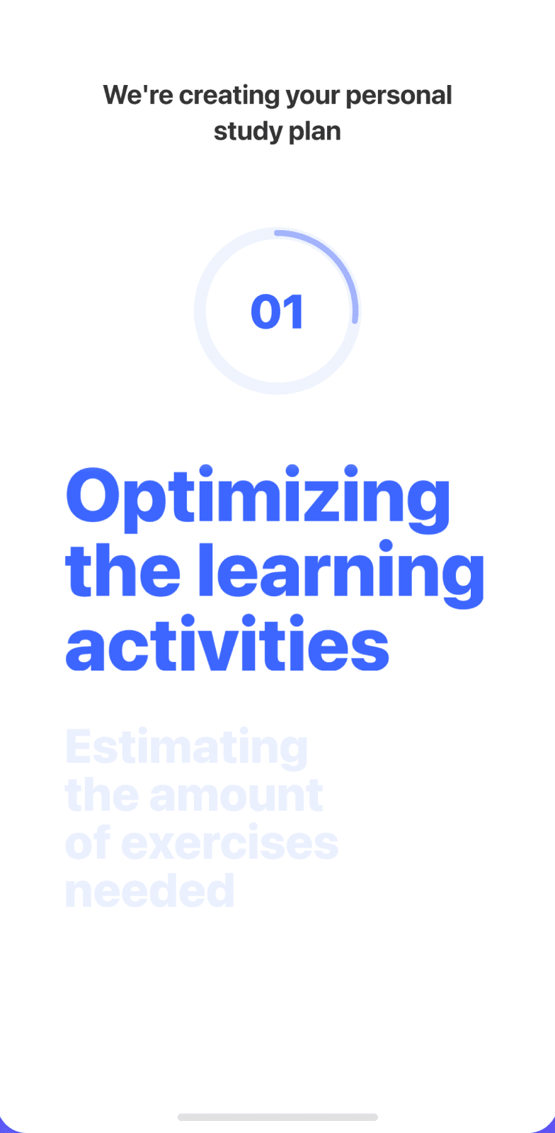
After the first lesson, we redesigned the wait screen for the personalized plan. Instead of showing an abstract animation, it explains each step of what happens to the user's information, making the wait feel more transparent.

The journey now ends with a summary of the learner's personal plan. It brings their answers together into a tangible result and reinforces the value of the process before the next step.


+24 unique tutors
We refreshed registration and added a step to learn where new users found us.

Success metrics

• Activation Rate — more users starting their first trial lesson after onboarding.

• Trial-to-Paid Conversion Rate — more learners converting from a trial lesson to a subscription.

• Drop-off Rate — fewer users leaving onboarding before their first lesson.